Making faster and better strategic business decisions with data from user friendly dashboards
HomeMaking faster and better strategic business decisions with data from user friendly dashboards
Case Study
Client profile
Client: Company in the beer & malt industry Industry: Retail, Beverages Process: User Centered Design approach to design dashboards
Our client is an international player in the beer and malt industry. They want to offer consumers, worldwide, a suitable beer for each and every occasion. And since consumers are changing our client wants to respond optimally to these changing needs to be and remain relevant and current.
Problem
All sales data comes together in our clients current reporting system. The company makes strategic decisions based on the insights from these reports. However, the current reporting method is cumbersome, complex and there is no coherence in the way of reporting. Moreover, the data are hardly visualised, which makes it harder to make informed business decisions.
Our client switched to a new S4/HANA environment, which significantly changed the way of reporting and dashboarding. Instead of working Excel-based, they switched to SAP Analytics Cloud, a business intelligence tool. To ensure that the dashboards in the new tool met the users’ needs and were user friendly, the Human Data Interaction Consultants (HDI) from Bright Cape joined in.
Approach
This project followed a User Centered Design (UCD) process to explore the user’s needs with interviews, surveys, and affinity diagramming. These needs were translated into wireframes, prototypes and ultimately BI dashboards. The goal was not only to create better dashboards, Bright Cape also wanted to demonstrate the added value of user research when designing BI dashboards.
A UCD process outlines an iterative design process in which designers focus on the users and their needs throughout the design process. Different methods have been used within the different phases of the UCD process to create the final dashboard.
Added value and solution
To demonstrate the added value of user research, a small experiment was devised around this. Parallel to the process that our HDI expert went through to create the final dashboard, a domain expert followed his own process for building a dashboard. The domain expert relied on his own expertise and did not conduct user research. In the end, this resulted in two dashboards with the same data, but with a completely different layout and design.
Both dashboards were tested in a user test, in which the user experience and usability were measured by means of performance metrics and self-report questionnaires. The dashboard created by our HDI experts turned out to be more efficient and effective and had a higher user satisfaction. The time on task was more than 50% lower and task success was almost 30% higher. Also, the System Usability Scale (SUS) score, Customer Satisfaction (CSAT) score and Net Promotor Score (NPS) were all higher for the UCD-based dashboard.
This quantitative data is supported by the qualitative data that has emerged from the user tests. Users indicated that the HDI dashboard was easy to use, intuitive, and more effective for gaining insights. This was mainly because the design choices that were made in the HDI dashboard arose from user input. Topics that were identified as important during the interviews and surveys – such as company strategies, performance figures and responsiveness – played a more central role in the dashboard. Next to this, all visualizations were designed according to IBCS standards, which helps to comprehend information faster. These things have led to users indicating that the dashboard was more clear and less complex, and it was easier to view something at a glance.
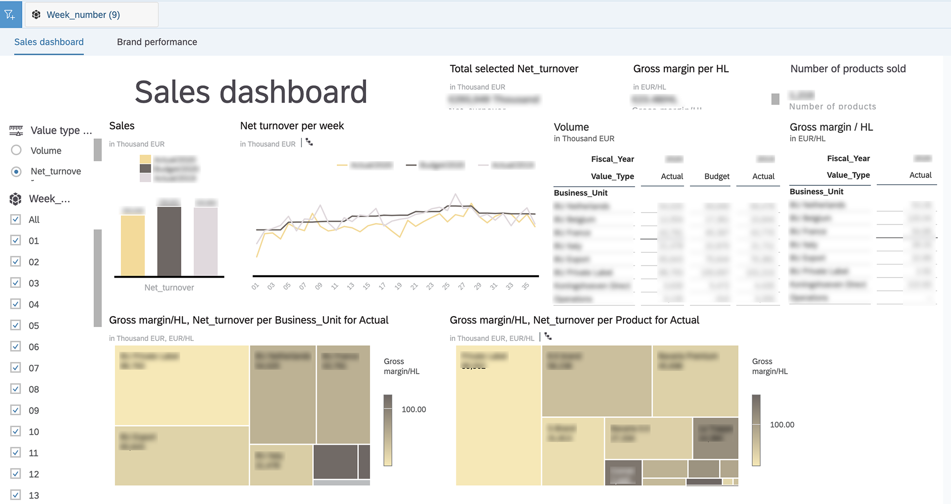
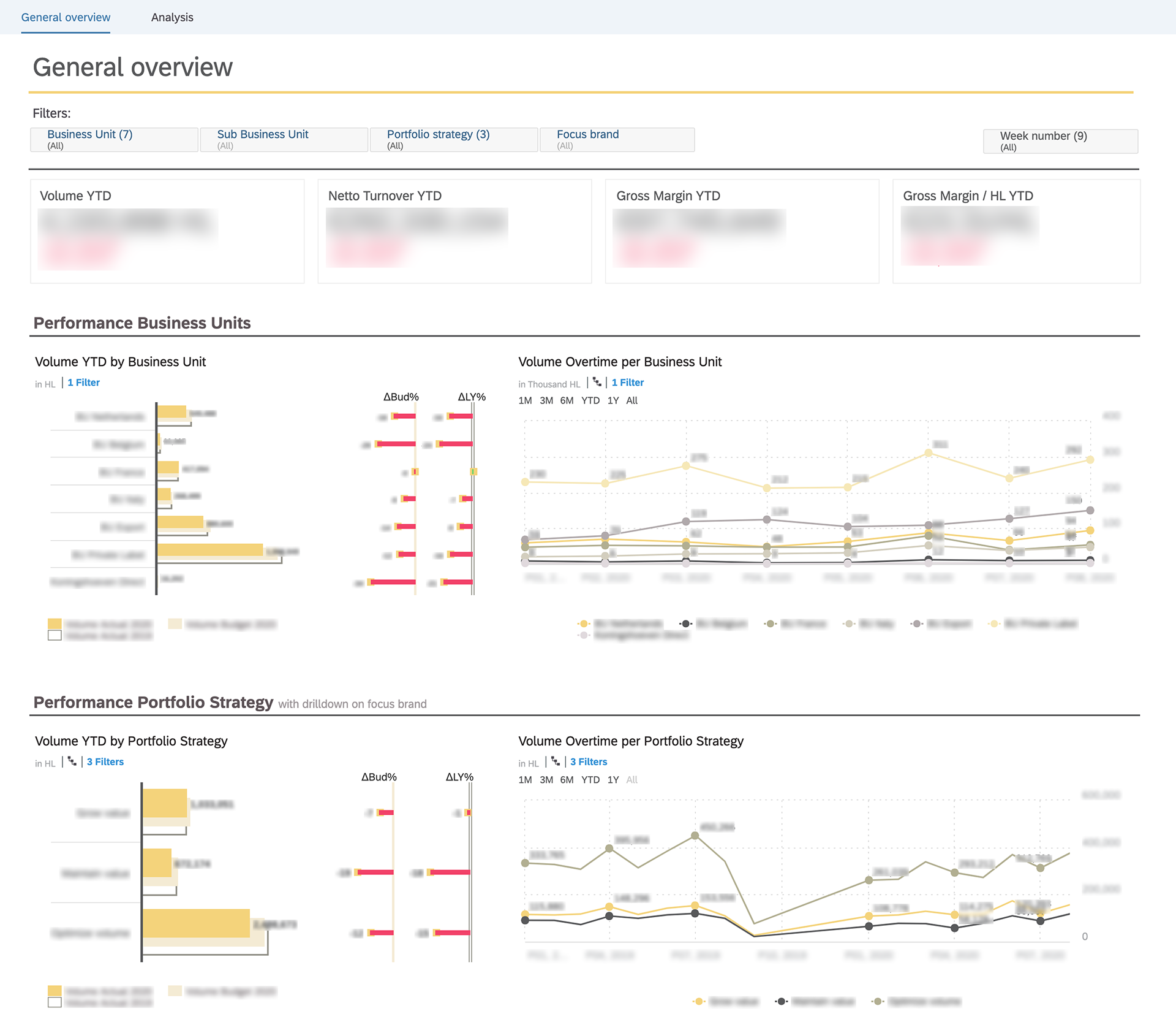
Dashboard created by the domain expertDashboard created by the HDI consultant
50%Reduction on time on task
Users were able to perform their tasks 50% faster in the dashboard that was build by our HDI team
30%Higher task success
In the usability test, users had a succes rate of 85%, almost 30% than for the domain expert dashboard
27+Higher SUS score
The SUS score of the old reporting was 57.8, for the new dashboard it was 85.3
Conclusion
Based on the scores of the metrics and the qualitative feedback, this project has made it clear that doing user research is of great added value when designing BI dashboards. The usability and user experience (UX) have been greatly improved and following a UCD process has moreover provided extra support. Given the costly implementation of BI systems, it is very important to make a product that is highly usable and accessible and that meets the user’s needs. By aligning the BI dashboard with the wishes and needs of the users, Bright Cape has created BI dashboards that are more effective, efficient and easy to use.
By combining the knowledge of a HDI expert with that of a Data Scientist, Bright Cape has enabled our client to gain more insights from their data, enabling them to make faster and better strategic business decisions.
We use cookies to ensure that our site runs as smoothly as possible. By clicking ‘Agree', you agree with the use of cookies as described in our Privacy Statement.